


Client
Elysian Essence
Client
Elysian Essence
Client
Elysian Essence
Industry
Luxury Fragrance
Industry
Luxury Fragrance
Industry
Luxury Fragrance
Deliverables
Logo, Guidelines, Packaging
Deliverables
Logo, Guidelines, Packaging
Deliverables
Logo, Guidelines, Packaging
Project Duration
3 weeks
Project Duration
3 weeks
Project Duration
3 weeks
Intro
Intro
Elysian Essence is a luxury fragrance brand concept I developed to explore a warm, feminine, and timeless visual identity.
Elysian Essence is a luxury fragrance brand concept I developed to explore a warm, feminine, and timeless visual identity.
Elysian Essence is a luxury fragrance brand concept I developed to explore a warm, feminine, and timeless visual identity.

Objective
Objective
The goal was to create a cohesive brand identity that communicates luxury through thoughtful design rather than relying on conventional luxury aesthetics.
The goal was to create a cohesive brand identity that communicates luxury through thoughtful design rather than relying on conventional luxury aesthetics.
The goal was to create a cohesive brand identity that communicates luxury through thoughtful design rather than relying on conventional luxury aesthetics.


Challenge
Challenge
Most luxury fragrance brands lean heavily on gold, minimal layouts, and traditional serif typography. I wanted to create something that felt equally premium but had its own visual character.
Most luxury fragrance brands lean heavily on gold, minimal layouts, and traditional serif typography. I wanted to create something that felt equally premium but had its own visual character.
Most luxury fragrance brands lean heavily on gold, minimal layouts, and traditional serif typography. I wanted to create something that felt equally premium but had its own visual character.
Submarks
Submarks
The identity combines a botanical emblem, crescent-inspired form, and refined wordmark. Together, these elements create a distinctive signature that balances softness with sophistication.
The identity combines a botanical emblem, crescent-inspired form, and refined wordmark. Together, these elements create a distinctive signature that balances softness with sophistication.
The identity combines a botanical emblem, crescent-inspired form, and refined wordmark. Together, these elements create a distinctive signature that balances softness with sophistication.
LOGO
VARIATION
01.
PRIMARY LOGO

02.
ICON MARK

03.
WORDMARK

04.
HORIZONTAL LOGO
HORIZONTAL
LOGO

05.
ICON VARIATIONS
ICON
VARIATIONS

Colors
Colors
A rich burgundy, warm beige, and midnight blue palette establishes the brand's visual character. Paired with elegant serif typography and a clean supporting typeface, the system feels timeless yet distinctive.
A rich burgundy, warm beige, and midnight blue palette establishes the brand's visual character. Paired with elegant serif typography and a clean supporting typeface, the system feels timeless yet distinctive.
A rich burgundy, warm beige, and midnight blue palette establishes the brand's visual character. Paired with elegant serif typography and a clean supporting typeface, the system feels timeless yet distinctive.
01.
COLOR PALETTE
IVORY MIST
#FAEDCD
SOFT
CALM
REFINED
TIMELESS
ROYAL MAROON
#5A0015
LUXURY
PASSION
ELEGANT
BOLD
MIDNIGHT BLUE
#000037
DEEP
TRUST
MODERN
SOPHISTICATED
SECONDARY PALETTE
PETAL BLUSH
#D9A7A7
FEMININE
VERSATILE
MODERN
SOFT ACCENT
CHAMPAGNE GOLD
#C9B17A
LUXURIOUS
PREMIUM
WARMTH
ACCENT
02.
TYPOGRAPHY
PRIMARY FONT ———— ELEGANT | FEMININE | TIMELESS
Aa
Times New Roman
A B C D E F G H I J K L M N O P Q R S T U V W X Y Z
Light
Regular
Medium
SemiBold
Bold
SECONDARY FONT ———— MODERN | CLEAN | VERSATILE
Aa
Inter
A B C D E F G H I J K L M N O P Q R S T U V W X Y Z
Light
Regular
Medium
SemiBold
Bold
Packaging
Packaging
The packaging translates the identity into a tactile product experience. Sculptural forms, contrasting colourways, and considered detailing bring consistency to the collection while giving each presentation its own character.
The packaging translates the identity into a tactile product experience. Sculptural forms, contrasting colourways, and considered detailing bring consistency to the collection while giving each presentation its own character.
The packaging translates the identity into a tactile product experience. Sculptural forms, contrasting colourways, and considered detailing bring consistency to the collection while giving each presentation its own character.
Collaterals
Collaterals
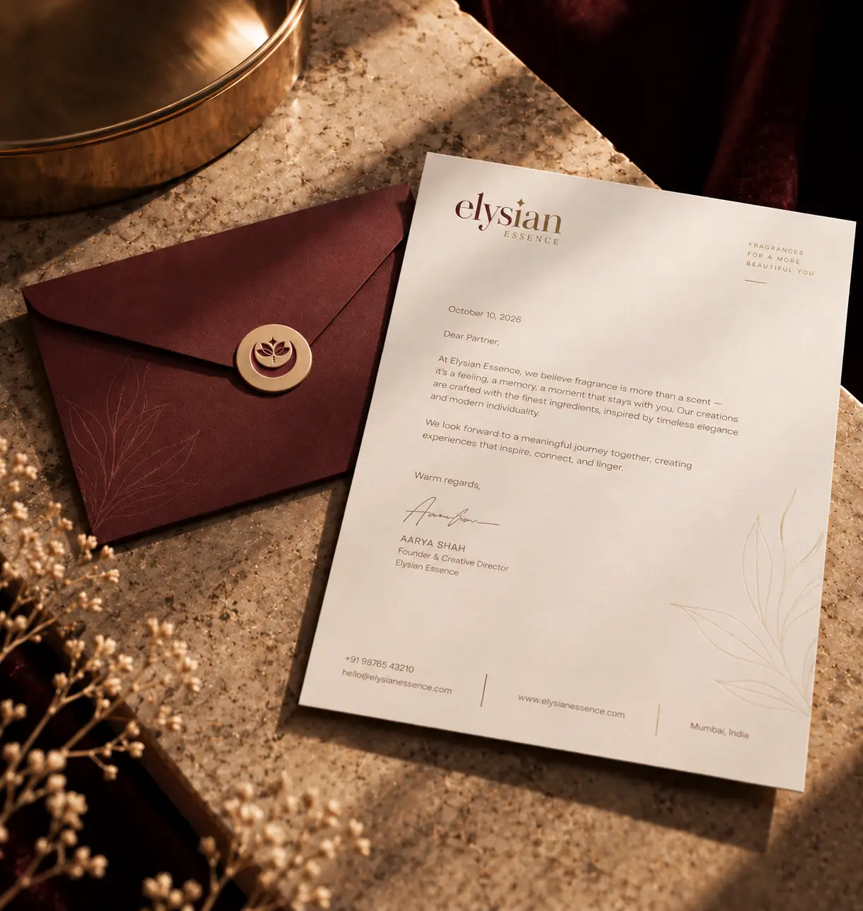
The stationery set carries the visual language across business cards, letterheads, and envelopes. Restrained layouts, warm neutrals, and burgundy accents create a consistent brand experience across every touchpoint.
The stationery set carries the visual language across business cards, letterheads, and envelopes. Restrained layouts, warm neutrals, and burgundy accents create a consistent brand experience across every touchpoint.
The stationery set carries the visual language across business cards, letterheads, and envelopes. Restrained layouts, warm neutrals, and burgundy accents create a consistent brand experience across every touchpoint.

Result
Result
I developed a complete brand identity, including the logomark, wordmark, color palette, typography, packaging, and brand collateral. The lily and crescent moon form the core visual elements, bringing a sense of elegance and warmth to the overall system.
I developed a complete brand identity, including the logomark, wordmark, color palette, typography, packaging, and brand collateral. The lily and crescent moon form the core visual elements, bringing a sense of elegance and warmth to the overall system.
I developed a complete brand identity, including the logomark, wordmark, color palette, typography, packaging, and brand collateral. The lily and crescent moon form the core visual elements, bringing a sense of elegance and warmth to the overall system.